


 Figuring out how much bonds dampen investment risk? Sometimes tricky.
You hear people offer bromides. Like “bonds provide ballast.” Or “bonds smooth returns.” But those truisms don’t really help you or me think objectively.
So this idea: Try plotting investment outcomes in a line chart that compares a portfolio that holds 100% stocks… to a portfolio that holds a balance of stocks and bonds. Say 70% stocks and 30% bonds. You can then visually see if and how much difference bonds make.
If you’re interested, I’ve got a free, downloadable Microsoft Excel spreadsheet that lets you this. But let me describe the approach I think works. And then I’ll walk you through the steps for using the spreadsheet for your own specific situation.
A problem to mention first, however. We don’t really have enough data to plot hundreds or thousands of investment outcomes comparing a 100% stocks portfolio to a 70% stocks and 30% bonds portfolio. If you want to look at 40-year accumulations or 40-year withdrawals? Well, the earliest usable stock and bond return histories for US investors start in 1871. That gives you or me less than four unique 40-year histories.
Thus, this idea: One can use average stock market returns and volatility to run a Monte Carlo simulation that plots likely scenarios. A bunch of likely scenarios. And then we can compare those. For example, you can run a 100 100% stock simulations. And 100 70% stock and 30% bonds simulations. Compare them using a line chart. And see how bonds affect the outcomes.
The chart below does exactly this, plotting two simulations, one I’m calling the Red Portfolio and the other the Black Portfolio. The Red Portfolio results show as red lines and depict one hundred simulated “100% stocks” portfolios over 40 years. The Black Portfolio results aren’t fully plotted. To keep the chart legible, it plots two dashed black lines. The lines show the best-case and worst-case investment scenarios of a balanced portfolio that combines 70% stocks and 30% bonds. (You can click the chart to see a larger image.)
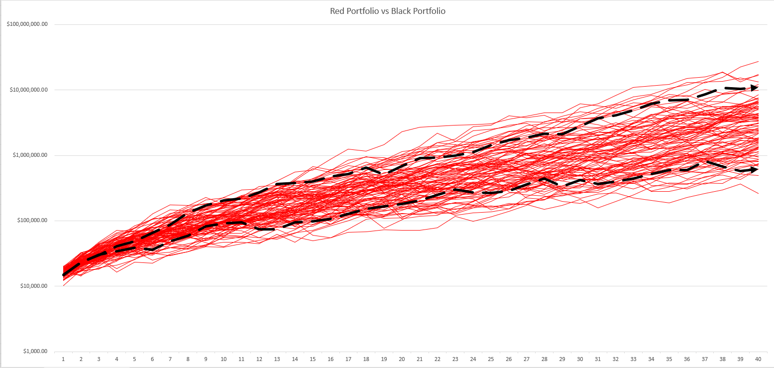
You may not even need me to explain this. But the dashed black lines show the benefit of adding bonds. You probably avoid those investment returns that show up as red lines that fall beneath the bottom black dashed line. All of those 100% stocks outcomes? Worse than the worst balanced portfolio outcome. But the other thing to note of course? You also probably lose upside when you add bonds. All those red lines that float off above the top black dashed line? All of those 100% stocks outcomes beat the very best balanced portfolio outcome. And that’s the way to visualize the trade-off bonds offer you and me. We probably dodge some downside. And probably give up some upside.
By the way, to keep the chart legible? It logarithmically scales the value axis for legibility. Thus, pay close attention to the scaling so the chart doesn’t mislead you. For example, while the upside risk and downside risk of using a 100% stocks portfolio visually look similar? Sort of a finger’s width? The logarithmic scaling means a 100% stocks portfolio might deliver way, way more upside risk than downside risk. (We’ll look at the actual numbers next section.)
A tangential comment? Note another reality suggested by the line chart. Over time, the range of returns for both the Red Portfolio and the Black Portfolio widen. That widening visually shows the passage of time does not remove risk. It increases the risk. (If time removed risk, the best and worst case scenarios would get closer and closer together… finally converging at some point in the future.) That’s interesting and something hard to understand until you actually “see” it.
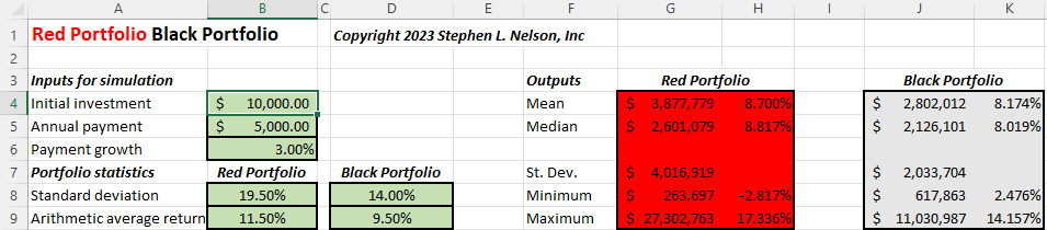
Take a peek at the green, red and charcoal spreadsheet fragments shown below. The green cells shown the input values: Starting balance, annual addition, growth in additions and then the two portfolio’s returns and standard deviations. The red and charcoal cells summarize the Red and Black Portfolio simulation results plotted in the chart just shown.
As you might expect, on average the higher risk Red Portfolio delivers a significantly higher average return (cells H5 and K5). Nearly one percent a year. That’s huge. And with that average annual return, an investor on average ends up with about $500,000 more money at the end of the four decades (cells G5 and J5). The higher average return of equities like stocks? The reason we all want to invest as much as we can bear the risk for.
Another tangential point: Online retirement planning tools like FireCalc and cFireSim don’t make it easy to see the downsize risk investors avoid by adding bonds. Or the upside reward bond investors lose. But as we’ve discussed in other blog posts ( Why Bonds Matter for Your Portfolio and Myth of the Long run Stock Market Return Chart), their historical data and calculations paint a similar picture.
If you’re ready to experiment with the free Monte Carlo simulations spreadsheet, download the spreadsheet (available here: RedPortfolioBlackPortfolio), and then follow these steps:
- Enter the starting balance into cell B4.
- Specify any additional annual amounts saved using cell B5.
- If you plan to increase the annual saving amount, enter your annual percentage adjustment into cell B6.
- Provide standard deviations for both Red and Black Portfolios into cells B8 and D8.
- Estimate the average return by entering percentages into cells B9 and D9 for both Red and Black Portfolios.
The workbook automatically recalculates as you enter the data. But you can and should press F9 several times in a row once you enter all the inputs to see additional simulations.
Some quick notes too. First, the logarithmic line chart can’t display negative values. Thus, if a particular simulation results in negative value (signaling a loss), Excel ends the line. (I try to protect against this outcome in most cases.)
Second, Excel may not be able to calculate rates of return for all simulations in which case the outputs will show the #NUM error. (The error occurs typically when the simulation produces wildly extreme results.)
Third, on some computers and with some display property settings? Excel doesn’t always finish updating the chart for every simulation. (If you encounter this, save the workbook to force Excel to redraw the line chart. Or display another window and then redisplay the Excel program window.)
That line chart show in the beginning? It tries to help you visualize accumulation scenarios with differently-risked portfolios. But you can also use the Red Portfolio Black Portfolio spreadsheet to simulate withdrawal situations, too. To try this, follow these steps:
- Enter the savings at the start of retirement into cell B4.
- Specify the annual withdrawal as a negative value using cell B5.
- If you plan to increase the annual withdrawal—such as for inflation—enter your annual percentage adjustment into cell B6.
- Provide standard deviations for both Red and Black Portfolios into cells B8 and D8.
- Estimate the average return into cells B9 and D9 for both Red and Black Portfolios.
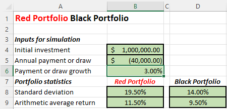
The spreadsheet fragment below shows how the inputs look for someone starting retirement with $1,000,000, planning to initially draw $40,000 but bumping this amount by 3% annually. The standard deviation and arithmetic mean inputs reflect a Red Portfolio invested 100% in stocks and a Black Portfolio invested 70% in stocks and 30% in bonds.
The line chart below shows a “withdrawals” Monte Carlo simulation. (Again, click the chart to see a larger image.) When a red or black line drops to zero or close to zero, that reflects a portfolio failure.
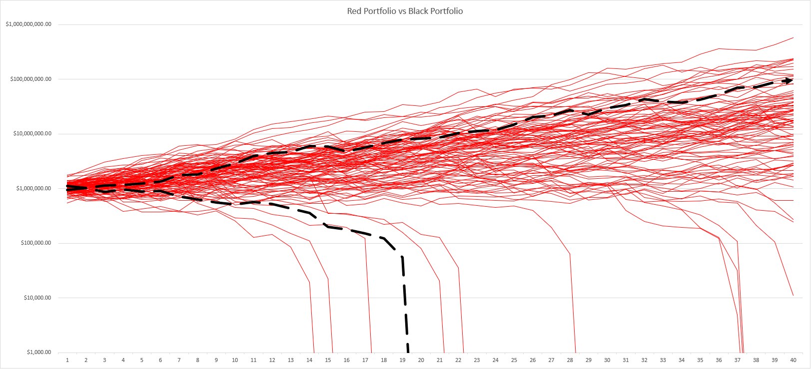
Note that nine or ten Red Portfolio lines drop to zero or nearly zero and so represent failures. That single black line doesn’t mean the Black Portfolio fails only once. That’s just the worst case Black Portfolio outcome. (The significant thing to notice here? The Black Portfolio maybe fails for the first time farther into the future. But you’d want to run several simulations.) Also note that three or four of the Red Portfolio failures occur nearly forty years into the accumulation. (That may not matter much.) The thirty year failure rate show above is 6% (6 out of 100 failures). Which roughly matches the conventional wisdom.
First of all, if you need help with the Red Portfolio Black Portfolio spreadsheet? Refer to the FAQ I created: Red Portfolio Black Portfolio Frequently Asked Questions. That resource answers a handful of questions and addresses some common issues (including how you come up with inputs to use for your modeling.)
Second, and related to the first point, if you get into this Monte Carlo stuff, know that you can get a good starter set of arithmetic means and standard deviations from Wade Pfau’s excellent resource: Historical Market Returns.
Third, we get so much content plagiarized at our blog, I put a password on the spreadsheet to make the theft a little harder. But if you’re interested in seeing the Microsoft Excel formula that calculates the returns? Just take a peek at this earlier blog post: Stock Market Monte Carlo simulation spreadsheet.
More Stories
Biggest stock movers today: Okta, Snowflake, and more (NASDAQ:OKTA)
EU leader warns of risks of wider war; NATO rules out sending troops to Ukraine
Bitcoin soars to two-year high above $56,700 as halving event looms